Standing out in a culture of copycat logos
Written by Imogen, Communications Assistant Intern at Hey Me
The trend of simplifying logos
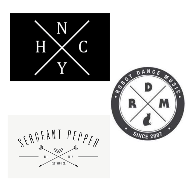
Every brand should have a recognisable logo – a design you see out of the corner of your eye and immediately recognise. In every aspect of life, trends come and go, and this is no different when it comes to logos and branding. For example, the early 2010s saw exponential growth in social media, and with this, ‘hipster-style’ designs became popular. One such logo-trend from this era is the crossed ‘X’ logo, as seen in New York hardcore (a symbol used to identify hardcore punk music), Robot Dance Music (the blog offering music on MP3) and Sergeant Pepper (the men’s clothing store).
And, over the past few years, ‘Scandinavian’ style modern design has flourished, bringing with it simplistic designs, basic colour schemes and a general sense of minimalism. Examples of this branding include many high-end fashion retailers, such as Balenciaga, Burberry and YSL, which have moved to logos featuring the brand name in a dark colour and simplistic font, without much additional detailing. Though this ‘clean’ and ‘ordered’ look brings a certain luxurious aesthetic, it also loses the vivaciousness and individuality of many companies.

The cycle of trends makes it difficult for businesses to ‘stand out’ in the branding world; uniqueness, originality and immediately engaging designs are hard to come by.
So, what are companies to do? Do they continue to follow the pack and transform to simpler and more toned-down logos (as is the current trend), or do they branch out and maintain distinctiveness? Have a look below at some insights from our expert marketing, PR and communications team on creating stand out logos in 2022.
Why do you think brands follow trends with their logos so much?
Sometimes it can be a conscious decision, but often it can be down to brands being so immersed in their industry that they naturally end up copying the look and feel of their competitors. On the other end of the scale, there can be a reluctance to stand out from your crowd so as not to deter your potential customers.
There seems to be a certain mindset that copying and pasting your competitors work will enable you to reproduce their results, but the reality is that looking too similar to a competitor or other business in your field can harm both your performance and reputation. Overall, it’s certainly a quandary why so many companies follow trends so regularly, and something which we as marketers really wish they wouldn’t do!
Why do you think the current trend is simplification and minimalism?
In a crowded marketplace, it is natural to go with the thinking that a clean and simple look and feel to your brand will stand out. And given that just over a decade ago brands such as Brewdog adopted loud, quite brazen branding, it’s a natural evolution that the trend now reverts to the opposite – to simplicity. However, trends come and go, so no doubt we will see a flip of the dial stylistically in the future.
What is Hey Me doing to stand out?
From our name to our brand look and feel, to showcasing our personality, we don’t really see Hey Me in the traditional marketing business light. We like to work with our clients as collaborators, and this is something we do through our sympathetic and engaging branding, nothing too shouty but nothing too simple. Our aim has always been to intrigue our clients, but not put any of them off from the get-go.
To learn more and speak to our team about all things marketing, communications and PR get in touch with us today!
Header photo by Aleks Dorohovich on Unsplash